

You have, literally, seconds for people to decide whether or not your web page is worth their time. With such a short time frame in mind, here are our psychology-based web design tips to help you to increase engagement and make a fantastic first impression.
Readers often make purchasing decisions, unconsciously and based on deep-seeded feelings they have when they first experience or first a product. If we think of your website as a product that the reader is considering purchasing then your job is to make that product as appealing as you can.
Now, when thinking about design this is no longer a left brain, right brain issue – you need to engage with both sides of a reader’s brain – both data-driven/analytical and creative.
Make connections from the start
You need to connect with your consumer from the very start and you need to do this with both images and words. Craft catchy headlines and use a cover photo that evokes emotional responses.
Colour selections
Different colours can evoke different feelings and associations so try and use that to your advantage. While no one colour will convert equally for every brand or website, you can employ some A/B testing to ensure you have the right selection.
As a guide:
- Red – excitement, youthful and bold
- Orange – friendly, cheerful and confident
- Yellow – optimism, clarity and warmth
- Green – peaceful, growth and health
- Blue – trust, dependable and strength
- Purple – creative, imaginative and wise
- Grey – balance, neutral and calm
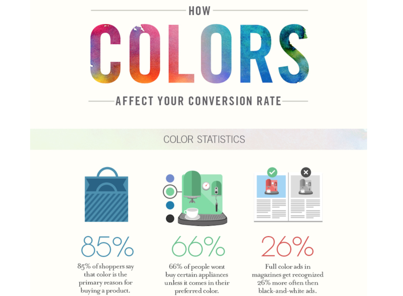
Think colour couldn’t possibly matter all that much? Consider this:
Fonts Choices
Just as readers make associations with certain colours, they also do so with fonts and typefaces. Keep your font simple and professional to avoid confusion and offence (yes, people get offended by cliched font types in logos and on websites).
Less is More
Today we are bombarded, overwhelmed by choice. Eliminate some of the choices on offer and focus on what’s most important. The more choices you provide, the more research they’ll feel obligated to do, the longer the sale funnel, the less likely they are to not convert.
By eliminating some choices you can quickly increase conversion rate.
Get Rid of Clutter
Your website should be professional, sleek and clean in appearance. Prioritise the information you want to communicate and try not to fit everything on one page.
How do you know what information to use? Well, that should be in line with your business goals, the nature of your product or service, and of course, your target audience, their problems and what they want and need.
You can interview or conduct surveys with consumers to get a better understanding of wants and expectations. These initial planning stages will give you insights into how to design your website.
Additionally, you could use A/B – testing to see if people respond to a certain layout better than another.
For additional help with your web design just contact the team at Website Design Centre.


