

The number of people accessing the Internet on mobile devices has outstripped expectations over the past few years! We know that to maintain our relevance our websites need to be mobile responsive but we shouldn’t lean too far to one side and forget about the desktop users.
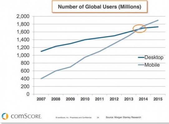
Mobile devices have changed the way, place and time that we browse websites, gain information, interaction with family, friends and brands. They have changed how we shop, make bookings, bank, pay bills – so much of our lives is now mobile. As predicted, 2014 was the year that we saw mobile users overtake desktop users.
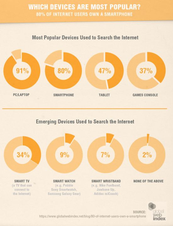
But mobile isn’t the only game in town. Statistics show that PCs and laptops are still the most popular device on which to browse the Internet so they definitely shouldn’t be dismissed altogether. See the graphic below from Q4 2014.
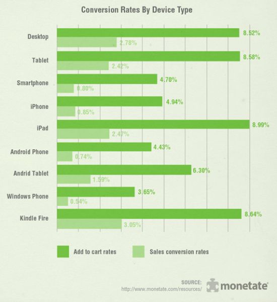
If you are involved in eCommerce or the emerging mCommerce (mobile commerce) then you should keep this in mind – while people will browse, research and add to the cart while on the move, most sales conversions (particularly large ones) are completed via a desktop. So if you think mobile first – fantastic BUT don’t forget that we they go back onto your website in order to take their cart to the checkout they are less likely to do so if your website doesn’t display correctly or isn’t easy to navigate on their desktop – the cart may just remain unsold. Time after time the results show that we are largely a multiscreening bunch. We don’t just use PCs, we don’t just use mobiles/tablets – 50-60% of us consistently used both – your website needs to appeal to users of both. Yes, think mobile first but don’t think mobile only, particularly if selling online is part of your business.
Need an mCommerce site or your current site updated to allow for both desktop and mobile purchasing – contact the Website Design Centre team.


