
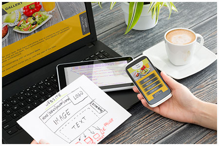
Over 77% of Australians own a smartphone and mobile represents over half of all ecommerce traffic and overall traffic (51%), a figure set to grow. As mobile technology becomes more and more popular in Australia it’s important to ensure that your website is more mobile-friendly.
A sign of the trend is Google recently expanding and prioritising mobile friendliness with their latest algorithm update. Here the Website Design Centre team offer the top tips to ensure you have a more mobile-friendly website:
Be responsive
Mobile responsiveness is when a website is designed to detect the device visitors are using and adjust the screen size and functionality accordingly. You can easily begin this process by designing for the smallest screen before testing on larger screens.
It’s also important to ensure that visitors can navigate your website and complete browsing, form completion, searching, purchasing and browsing across different devices with too much confusion or inconvenience. Consider a ‘save’ or ‘share’ function to allow for visitors to continue their journey at a later time.
Easy search
Search functions are extremely important on mobile platforms and so are extremely important when designing your website. Make the search bar is found on each and every page and consider features such as spelling suggestions and auto-complete – both of these will serve to reduce the time taken to type in required information.
Quick and easy forms
Like with the search function above, you need to make form completion as quick and easy as possible. Reduce the number of essential fields, add auto-fill functionality, and consider a progress bar so users are aware of how much more there is to complete.
Functionality
Functionality is the key to designing a mobile-friendly website. Factors such as links, scrolling banners, site navigation and menus should all be designed with thumbs in mind. This simply means that all of your site elements need to work for mobile scrolling, sliding and tapping. Avoid the viewer needing to ‘pinch’ – content is too small if pinching is required and you’ll only see an increase in site abandonment.
On mobile-friendly websites simplicity rules – place all crucial information such as user account functions, search bar, key promotions, popular content, main menu and logo above the fold. Remember that with mobile less is more. This mantra also ensures that information is able to be spaced out to avoid wrong clicking.
Mobile searchers will only tolerate a load time of up to five seconds so avoid heavy graphics and content that slow load times and annoy viewers.
A few extra tips
- Use video wisely, keep clips to under two minutes – they are more likely to be watched and they not interfere with load times too much.
- If you run a mobile version of your website and a PC version rather than being fully mobile responsive, never use the term ‘full site’ when referring to the PC site. This term implies that the mobile version is incomplete and viewers are not receiving all the information that PC users are.
- Use geolocation technology to direct users to their nearest store, provide information in local times and currencies, or to offer targeted promotions.
- Provide the choice to check out as a guest rather than an account holder to speed up the checkout process.
- Use lists and bullet points rather than long-form content to allow viewers to quickly and easily scan and identify the information they are seeking.
To learn more about designing websites to be more mobile-friendly, contact the team at Website Design Centre.


